Like so many people stuck at home this year thanks to stay at home orders and quarantine 2020, we stared at the walls that surround us all spring and made project lists galore. Over the summer, we joined a lot of you in investing in long-dreamed-of home renovations. This time, our kids were the lucky ones, and all three of them got new bathrooms {the shared bath in today's post as well as an ensuite bathroom...future post alert ;)}! I'm pretty sure it's me that cares more about the new spaces than the boys do, aesthetically speaking, but we definitely consider the updates we made to be an investment in our home, keeping in mind that we may downsize and sell in the coming years as the boys leave for college.
Today we're showing you the changes we made in our twins' shared bathroom, and next week we're diving into the numbers behind a bathroom renovation like this one!
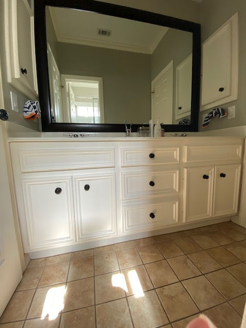
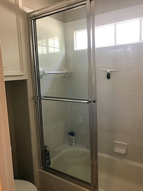
BEFORE:


It's been on our list for years, ok, MY list, for years to update the secondary bathrooms in this house. The finishes we replaced were original to the house, and were very much builder-grade choices that worked just fine for us all these years. Yet, we knew that these spaces would look very dated by the time we would be ready to sell, so we bit the bullet and decided to go for it!
Our big to-do list in this bathroom included removing the bathtub and creating a walk in shower, updating the countertop, replacing the sinks, plumbing fixtures and the toilet, new tilework throughout, and updating the cabinets. Since we didn't move any plumbing lines and left the cabinet boxes in place, I wouldn't call this a complete gut job...but it was close.

The boys loved seeing how much more space they'd be getting with a walk in shower during the process! Our other son's bathroom still has a tub (always a plus for resale) but he'll be able to graduate to this bathroom when the first two leave the nest!
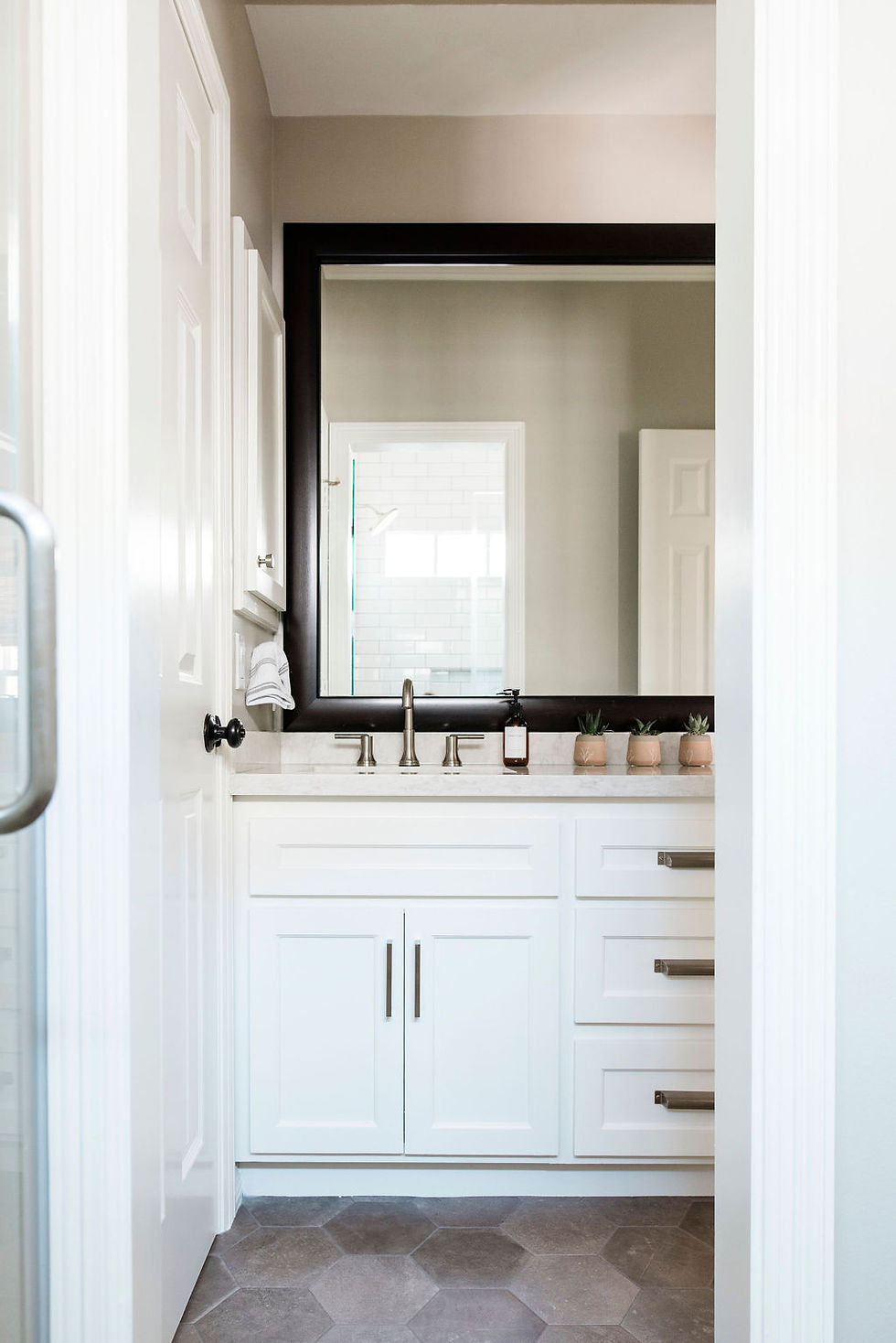
AFTER:

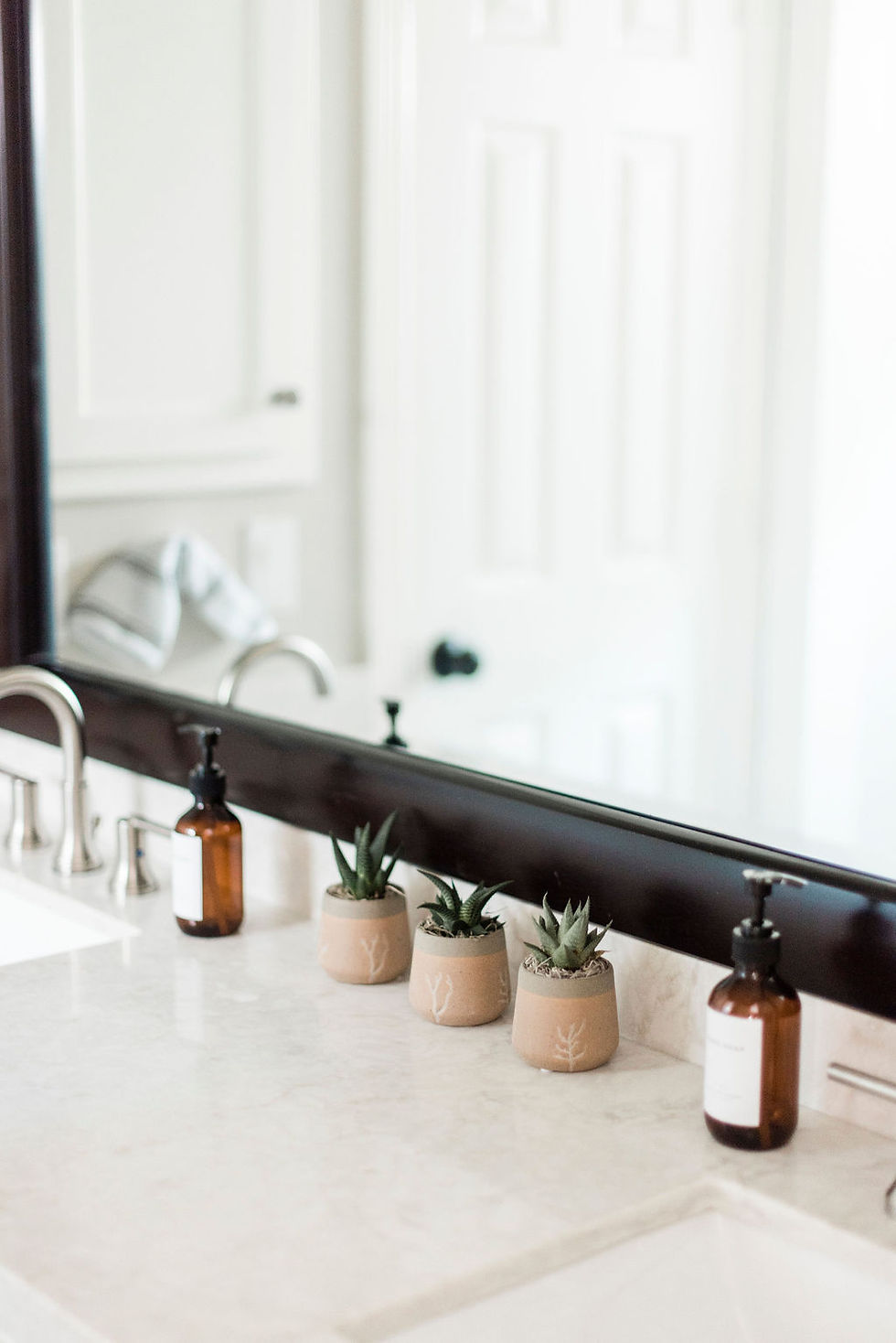
When we refaced the cabinets in the kitchen and living room (stay tuned for that reveal), we knew we wanted to update the bathroom cabinets as well. We went with a more simple Shaker style cabinet face with a thin inset of trim to coordinate with existing door and upper cabinet trim detail. We added interest with a mix of modern pulls and knobs in brushed nickel. I cannot tell you how happy it made me to replace the dated, stumpy faucets with simple but classic gooseneck faucets in a brushed nickel. #instantupdate I was tempted to do a more modern black finish but I've seen too many issues with the finish coming off due to chemicals in household and beauty products over time so personally I wanted to steer clear and stay classic. With the new countertop we were able to update to new undermount sinks as well which making cleaning a breeze. We also took the opportunity to install comfort height toilets in all the bathrooms. I highly recommend doing so if you don't have a comfort height toilet and are changing the floor out anyway...it's the perfect time really.
Let's talk about the mirror situation. Now I know what some of you might be thinking...I hear you. We definitely went around and around about replacing our huge, framed mirrors with something more stylish. Although I selected large metal framed mirrors to go above each sink, my gut wouldn't let me push the button on ripping out the existing wall mirror and frame. Bottom line it never seemed worth the splurge in budget to have less mirror to look at (and bounce light around). We'll do a deep dive on decisions like that will come through in next week's post around budget!

Let's talk about this gorgeous floor. I'll admit I fell in love with a gorgeous geometric print pattern on the floor and thought about using it here. But let's be real...this is a bath for teenaged boys and the glory of that gorgeous floor would have been amazing to photograph but it would be wasted in the space (which is FINE because guess what bathroom is on the radar as the next home reno project ;) You guessed it if you said MY bathroom. #alreadymakingplans). We ended up selecting this beautiful updated gray hexagon tile. It has a slight linen texture with a good bit of variation in color. We love this choice not only because of the shape and color but also because we were able to choose gray grout, which will stand up to two teenagers with no issues!
In the shower below, we chose a coordinating small square tile for the shower floor and went with an elongated subway tile in a horizontal staggered pattern. I used a different layout in my original plans for this space but opted for a more traditional pattern that is still updated with the use of the elongated tile itself. We selected an oversized shower head and new hardware in the same finish as the faucets in the vanity area. I don't know who's happier with the end result, me or my boys but either way we all win because the bathrooms now definitely look as updated as the rest of the house and most importantly they function better for our growing guys!

Are you thinking about a renovation for a secondary bathroom? Stay tuned next week as we break down the costs of this project step by step!

留言